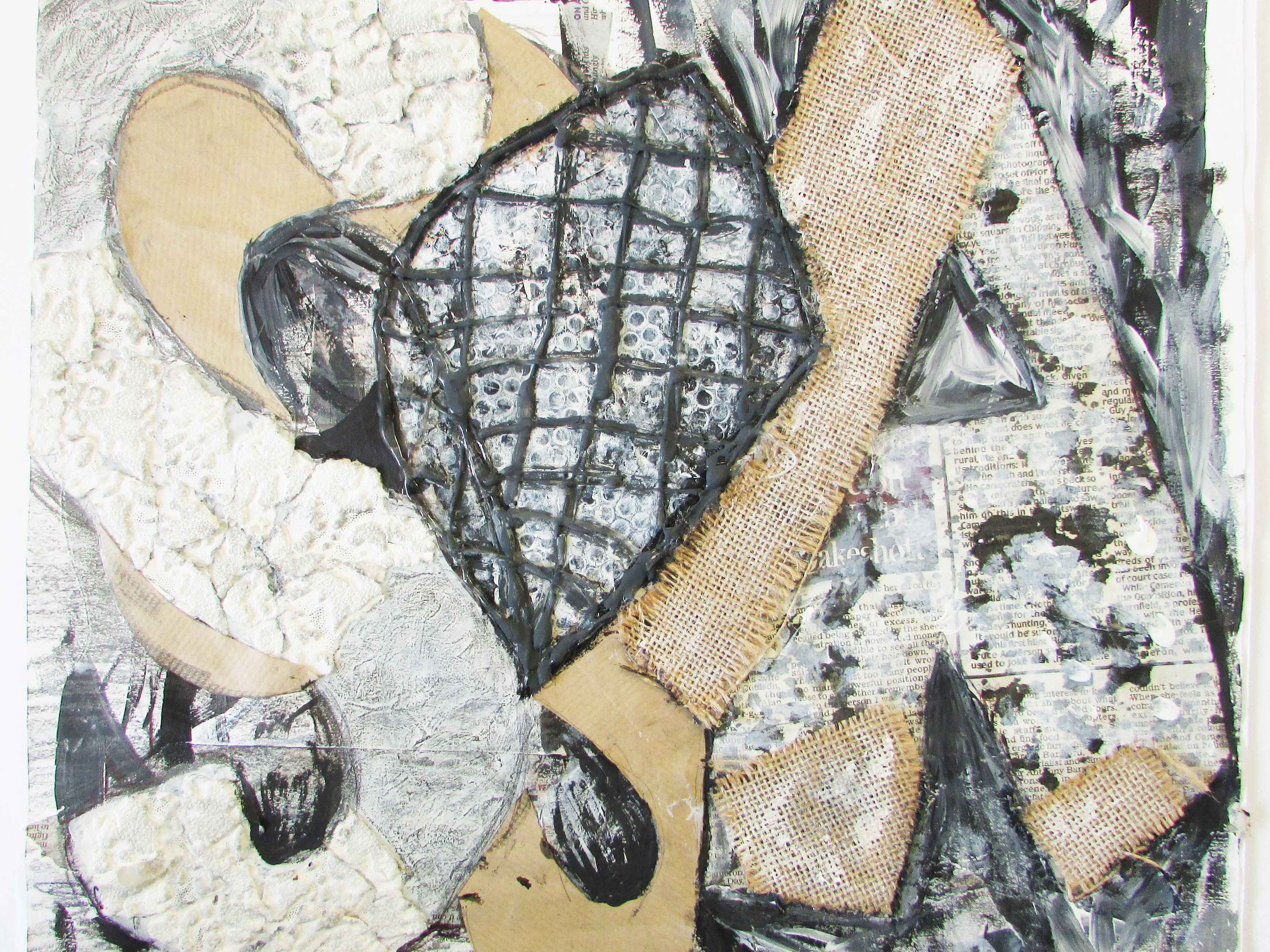
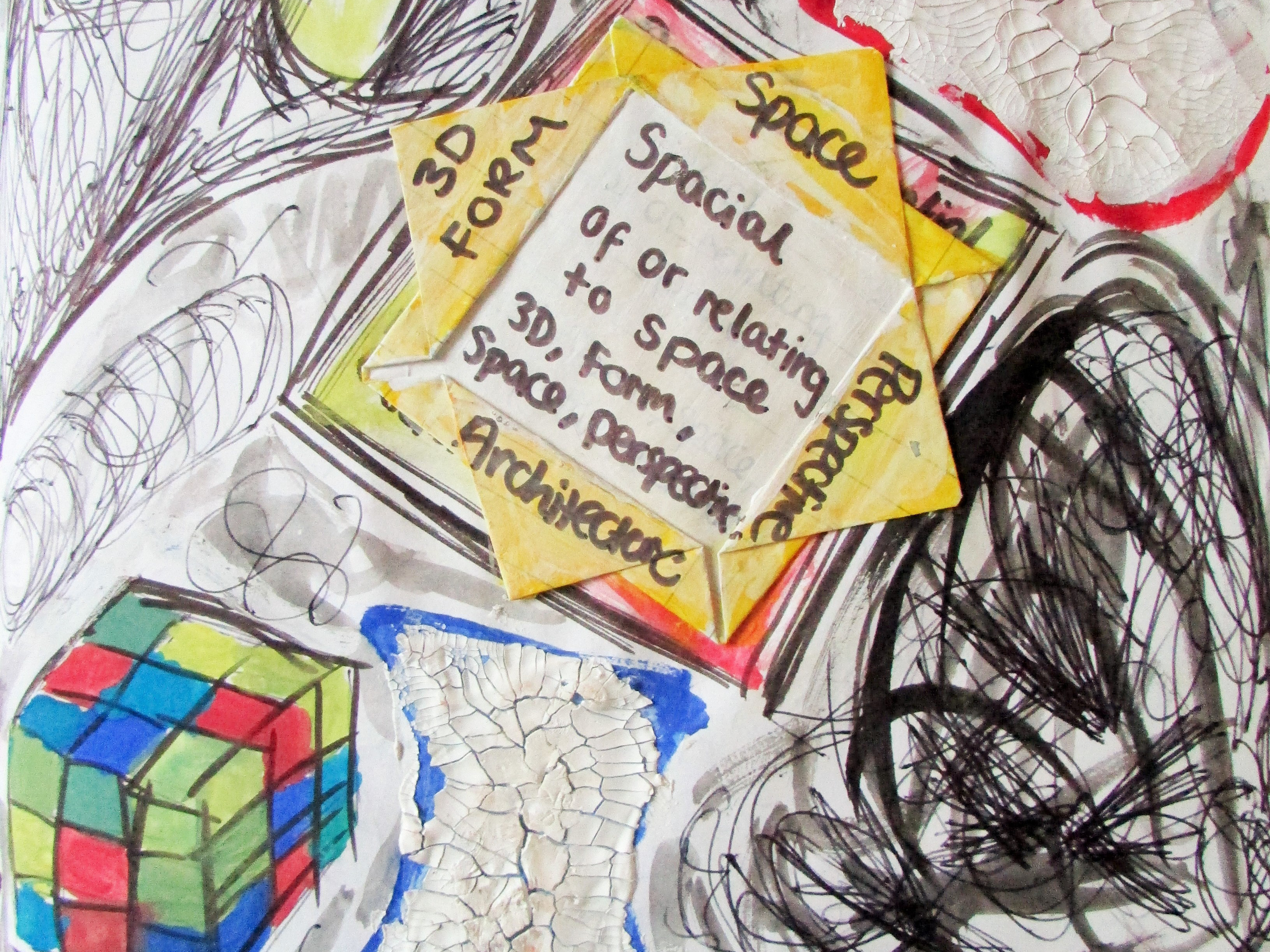
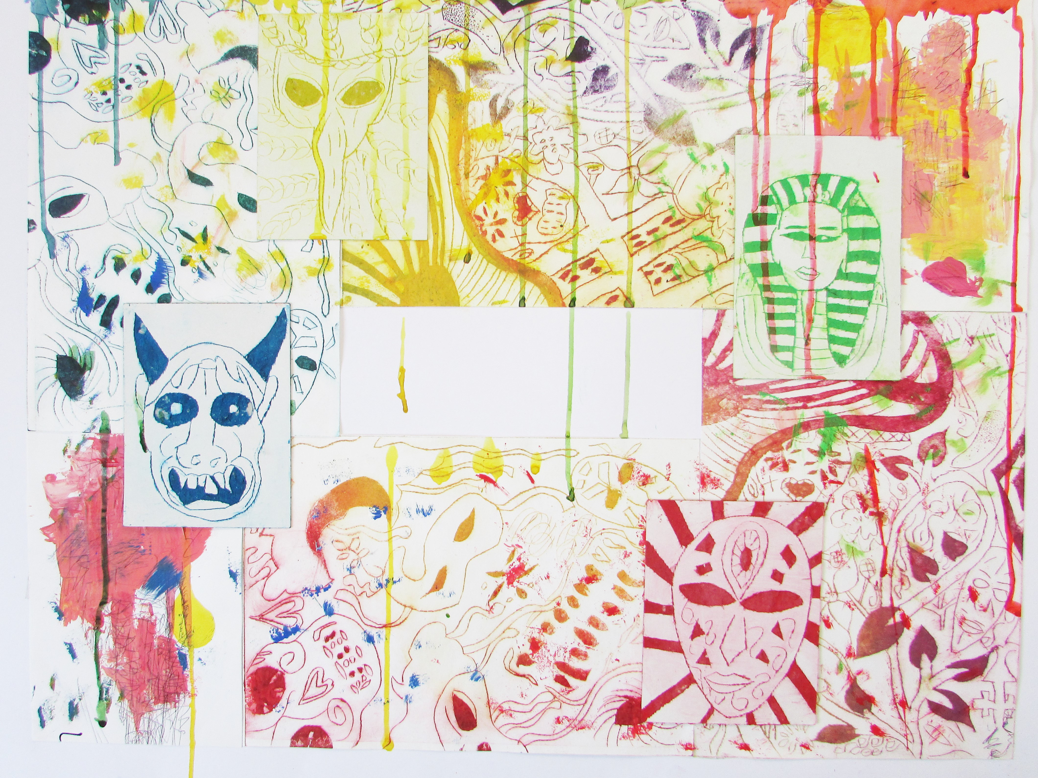
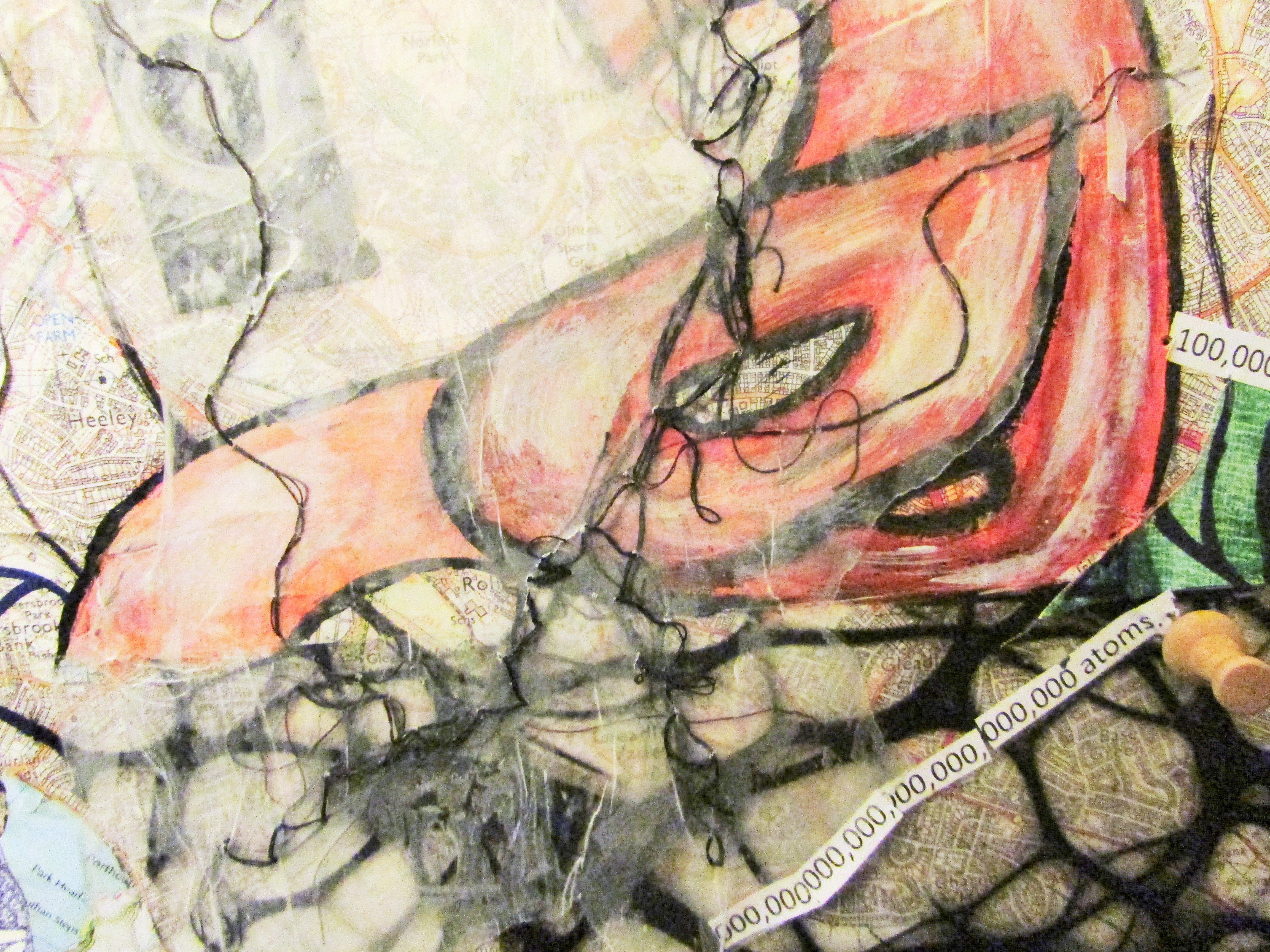
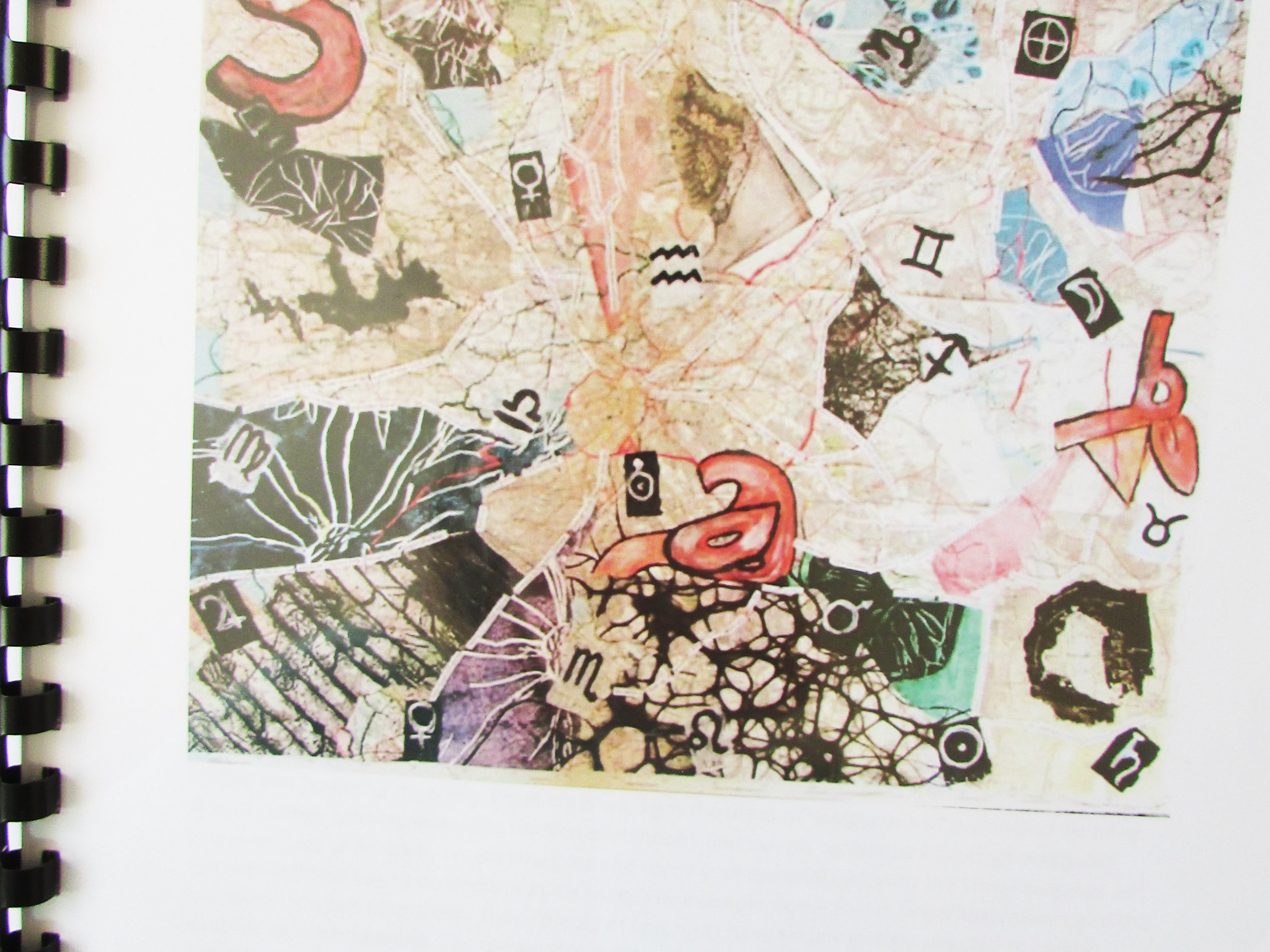
This is a composition page of venetian and carnival masks that I looked into. I used watercolour to add an interesting background too.
Here is my design concept page of children viewfinders and the facts of the only truth is death. This was initial Ideas of my outcome.
Here is my first printmaking page. I used these colours to begin with to represent the colours used by Stained glass. The first print is a Lino cut of the day of the dead mask. and the other is a monotype print of drawing in stained glass.
Here is a quick sketch of vases that were in the Egyptian temporary gallery in Western Park. I used Acrylic paint. The other two experiments were a textured paper with paint on and clay that I engrave into it to create symbols used by the Egyptians.
Here is my Papyrus that I brought and coloured in. I used a thin paint brush and acrylic paint.
Here was my experiment of projecting light onto vases and masks like the Cabinets in the Treasures Gallery: Egyptian masks and vases.
Here is photos of my own sculpture projection inspired by Tim Noble and Sue Webster' work of showing the truth.
Here is my skull watercolour and indian ink experiment I did separating the colours of the ink to show the truth behind it.
Here was an experiment of dipping watercolour down from a mask | similar to Marion Bolognesi.
Here is my experiment of the lino cut print with indian ink and watercolour, which was influenced by the skull experiment I did separating the colours of black ink.
Here is the acetate projection photos I did. I re toke the ones which a tick next to them that were turned into a study sheet.
Here is a coloured in acetate that could not project the colour with a watercolour black and white gradient background.
Here is a smaller version of the freestanding cellophane piece that was in my sketchbook to show the design.
Here was the freestanding cellophane piece. As you can see it didn't work as well as the cellophane project shown below.
Here is a quick experiment of the golden detail in the Ruskin, creativity and craftsmanship gallery that felt was the only part which was relevant to me.
Here is my experiment of Marion Bolognesi work using watercolour paint.
Here is my composition work out page of the triptych times 5 idea came from.
Here is a collograph experiment using acrylic paint and biro. I stuck with the colour scheme for this of pink blue and green as I did with the colour graph page.
Here was a quick experiment of connecting the watercolour/ indian ink panel to the acrylic panel but I used a thick liner instead of a biro and I prefer the biro.
This was my experiment of acrylic paint print with white sewing on top to show parts of the print hidden below. The bright colours acts like Stained Glass Panels.
Here is one of the three cellophane projection photographs I used in my final piece. I constantly rotated the cellophane to create different compositions. The other two photos are down below.
Here is another one of the cellophane projection photos that were taken.
Here is another one of the cellophane projection photographs that was taken.
This piece is my contact sheet of the photos I redid. The ones with a biro mark underneath the image title are the ones I used in my final piece but made A5 size.
This is my experiment piece of acrylic paint applied with a palette knife and my cellophane piece on the lino cut day of the dead mask prints.
First of all, I started to look into the three words by creating a pinterest board focusing on truth, fantasy and fiction. During this research I came across these three artists: Henry Clarke, who focuses on stained glass paintings. Stained Glass links with the Truth element of the stories told in stained glass windows, mainly in Churches. Reda Abdel Rahman who focuses on Egyptian art and the true stories around that into art, and finally Wendy Andrew who focuses on wildlife and fantasy animals. These three artists helped me lay a foundation to my initial research to pin point an area to explore. This is when I started to research into masks and identity.
Venetian, Carnival, Japanese, African and Egyptian masks I developed studies and experiments in, while starting to develop compositions using my research on each mask. Then I developed design concepts that I looked at skulls as the initial mask which is hidden by a mask to hide the truth. ' The only truth is death'. Children's viewfinders- mask on the film that the child turns and a skull on the window finder. This was the first initial idea I came up with, from the research I received first.
Next I did some more printmaking again, I looked into printmaking, monotype and lino cut, collograph, and dry point. These pieces were influenced by masks and stained glass work I have done, but also my gallery visits to western park and millennium gallery which is embedded throughout the time I did my 4-5 week printmaking class once a week.
The first gallery I visited was western park museum in Sheffield. 2 of these exhibitions were permanent collections while 1 was a temporary exhibition which was the main reason I visited the gallery. Secret Egypt- Unravelling Truth from Myth. The title of the exhibition really is obvious how relevant this was to my project of truth and fantasy in Egyptian art. I photographed a few pieces of art (not mummies as well we can not walk them up), and brought some papyrus which is photographed above that I painted. As well as buying Papyrus, there was mark rubbings in the gallery to interactive with, a dress up area, and sheets to fill in on things you find around the exhibition. In the exhibition there was 2 mummies and in the permanent exhibition was 2 more mummies in Treasures Gallery Egyptian and masks. I visited this to fill in the names of the other 2 mummies but also to see if anything else will sparkle an idea, which it did. The art had a few masks etc but I found the shadows created from the lights on the masks more exciting. Tim Noble and Sue Webster were an external research I did who use rubbish to create a sculpture and once light is projected onto it on a wall, people shadows are created. I created my own sculptures to show the truth behind the actual object kind of thing.
After this I visited the What's On Earth exhibition focusing on the life and death element, before I moved onto creating mixed media studies with watercolour and indian ink which water separated the ink to show what colours made up that black, showing the truth of the ink. I progressed to include this ink on my prints that I had created in a similar style.
Then I decided to project masks onto a face like a mask. To do this I printed out different style masks onto acetate in black and white. Then I decided I wanted to project colour too and tried painting the acetate in, which once projected only created a black space. So with this I painted a black and white gradient in my sketchbook before sticking it in. Then I looked into the photographer Wanda Wulz who is famously known for her photographes of blending a cat and human face together. Acts like a mask. Then I worked a solution for the colour projection using cellophane. I created a free standing stained glass cellophane piece which I glued together using hot black glue gun. I toke photographs of this experiment by the subject holding the piece in front of their face.
Going back to the Museum visits, I visited the Millennium gallery which had a temporary exhibition on called In the making (Ruskin, creativity and craftsmanship). 2 rooms one the main exhibition and one called craft and design exhibition. Majority of this exhibition was not relevant to my project. However, I did like the gold detailing on posters in the exhibition which is semi relevant with the stained glass.
Next, I did an experiment of face paint, and painting a mask onto a face using my Stained Glass design from my mask (see study sheet post). I also added a contextual reference of David Bowie Aladdin Sane (Ziggy Stardust) by masking Identity.
Marion Bolognesi was another artist I progressed to look at. She created watercolour painting of colour of makeup dipping down a face, similar to my skull watercolour work. This was one of the first concepts that I knew I was going to include in my final piece. Then I started to look at the structure and composition of my final piece. I looked at Triptychs. This is because I had looked at doing triptychs at the beginning of A level and wanted to include more of it. I settled on the order: projection masks, lino day of the dead, collograph masks, cellophane mask, dry point influenced my galleries.
I progressed experimenting with media of acrylic paint and biro on the masks. This was inspired by a experiment I did in my coursework using a palette knife to apply the acrylic paint in my botanical garden research. From this I linked the watercolour version and the acrylic together to create a panel of two before forming the last panel to create a triptych. Then I created a colour chart of which colours to use in each triptych. I settled on light to dark before doing an experiment of watercolour and indian ink experiment on collograph and on different textures (photos triptych which material holds better on card or paper for the watercolour part. Card was the answer even though the water at first rolled on top).
Before the exam time of 10 hours, I redid the face makeup to look clearer and I re toke the cellophane photographs by projecting them onto the face using the overhead projector like before and used a DSLR camera opposed to a SLR. Then I decided on the cellophane photos opposed to the makeup photos as I felt like they were more professional. After this I developed the cellophane on print experiments and added white sewing on the acrylic sections to bring up parts of the design (like clues hidden pieces).
Finally I created several mock ups and created a measurement page to work out what sizes my foamboard that I was mounting my prints and photos on was. I also added the contact sheet of the cellophane photos and projection to see which ones I wanted in my final piece. I used 6 different photos in total. I finally did a acrylic to cellophane experiment with the black glue and blended them together so that it flowed as a piece.
