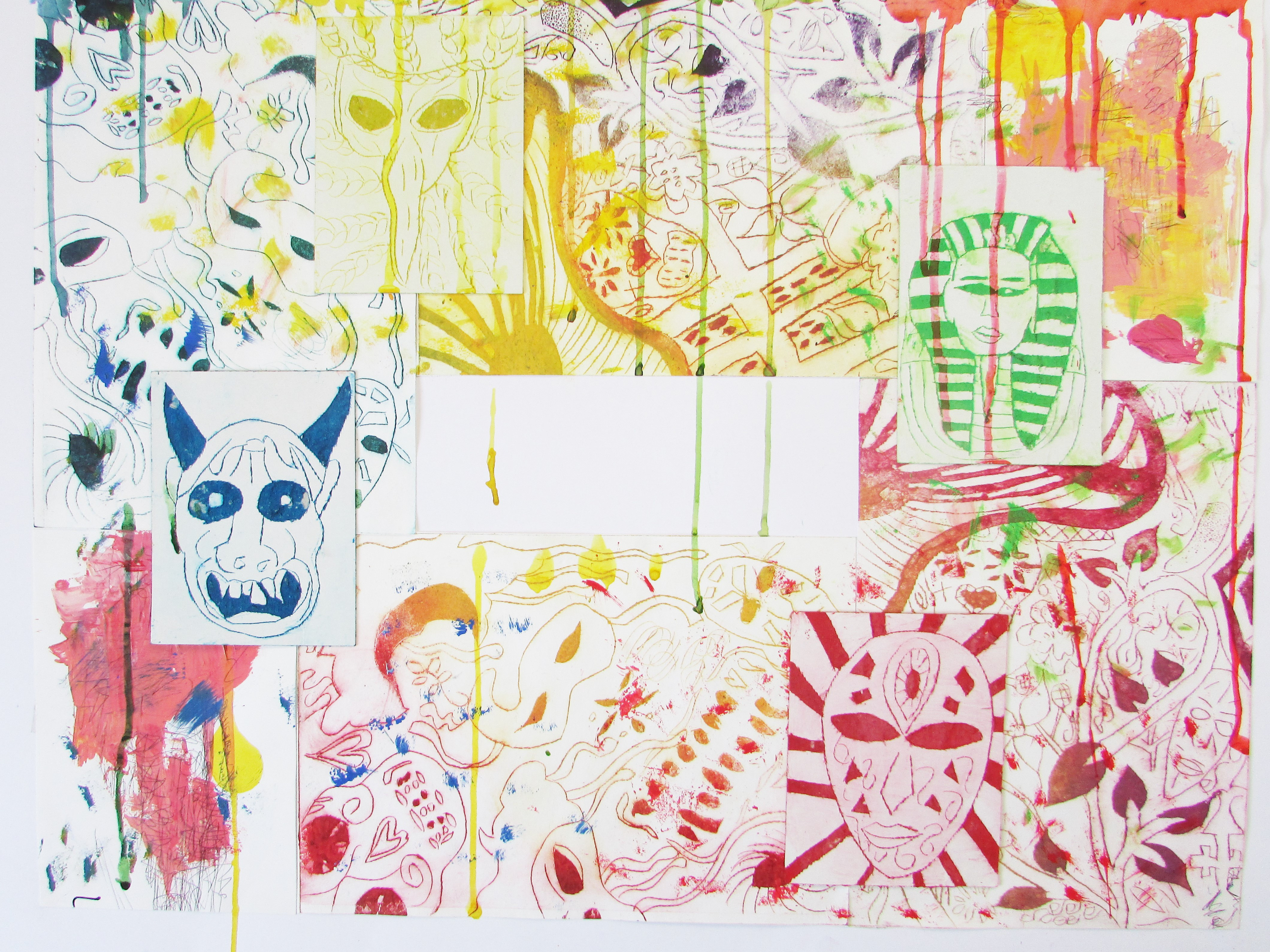
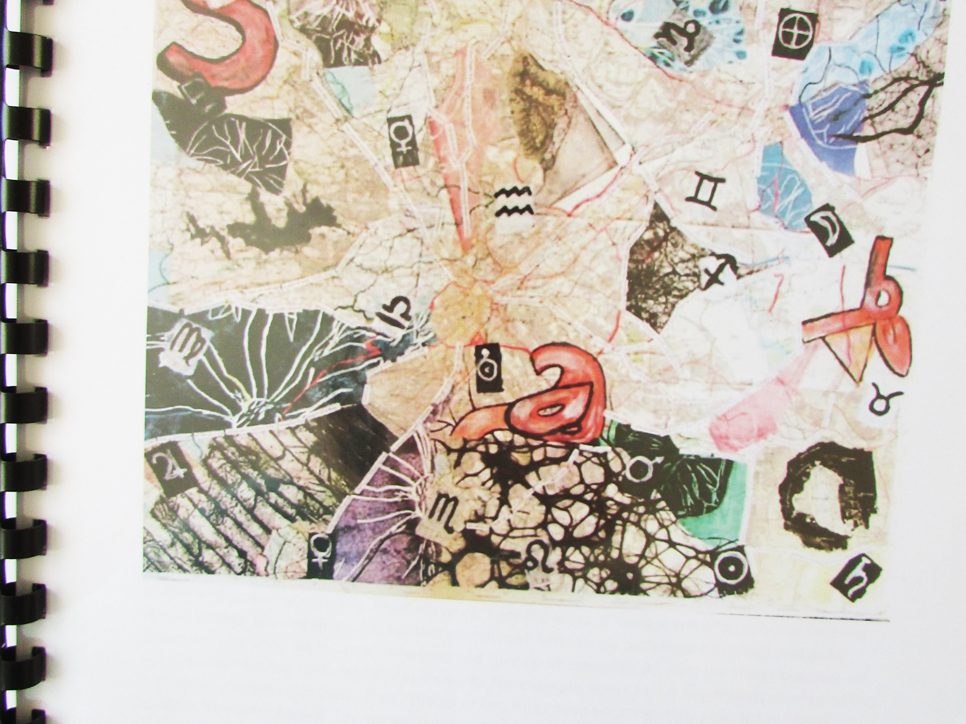
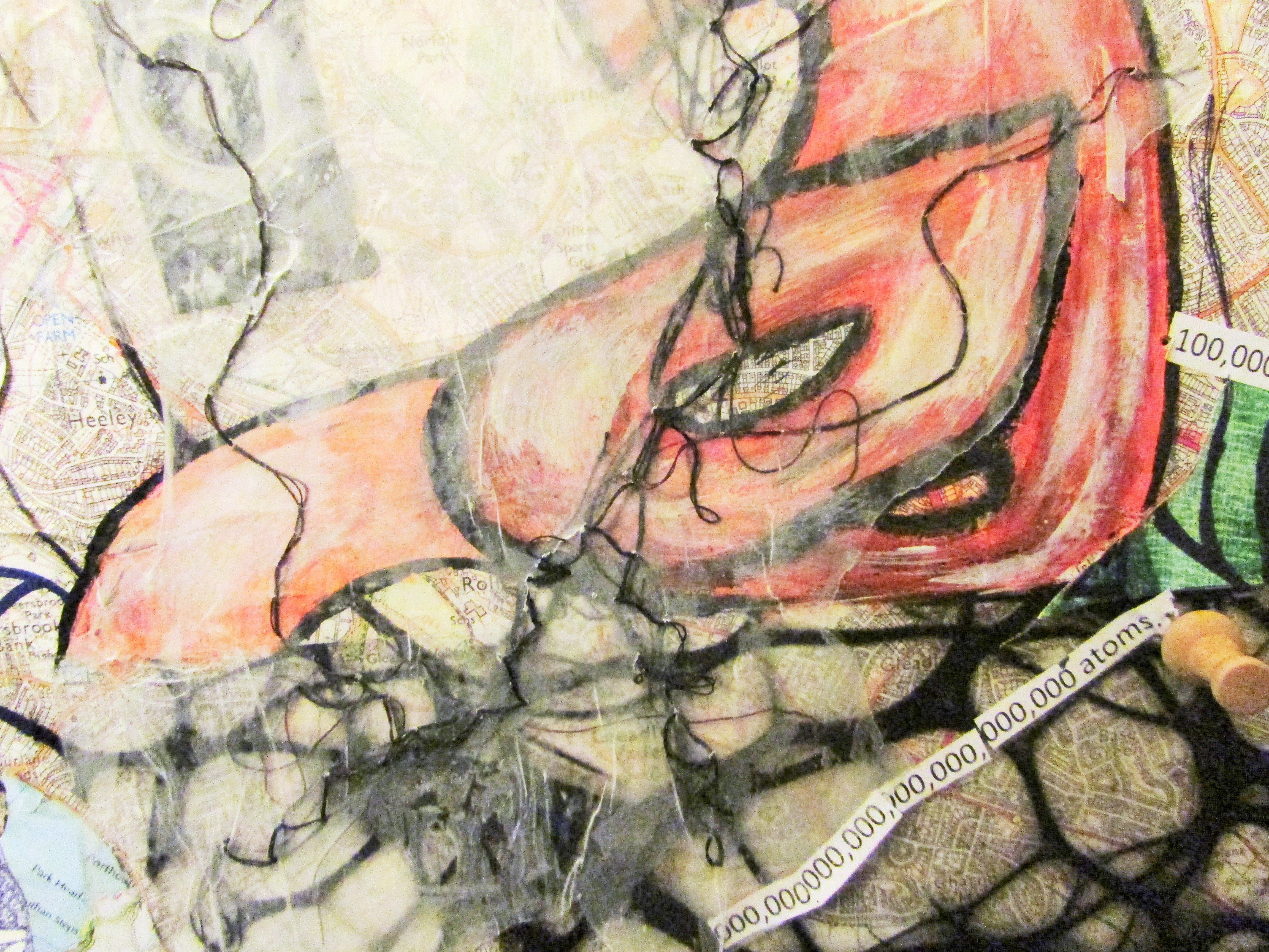
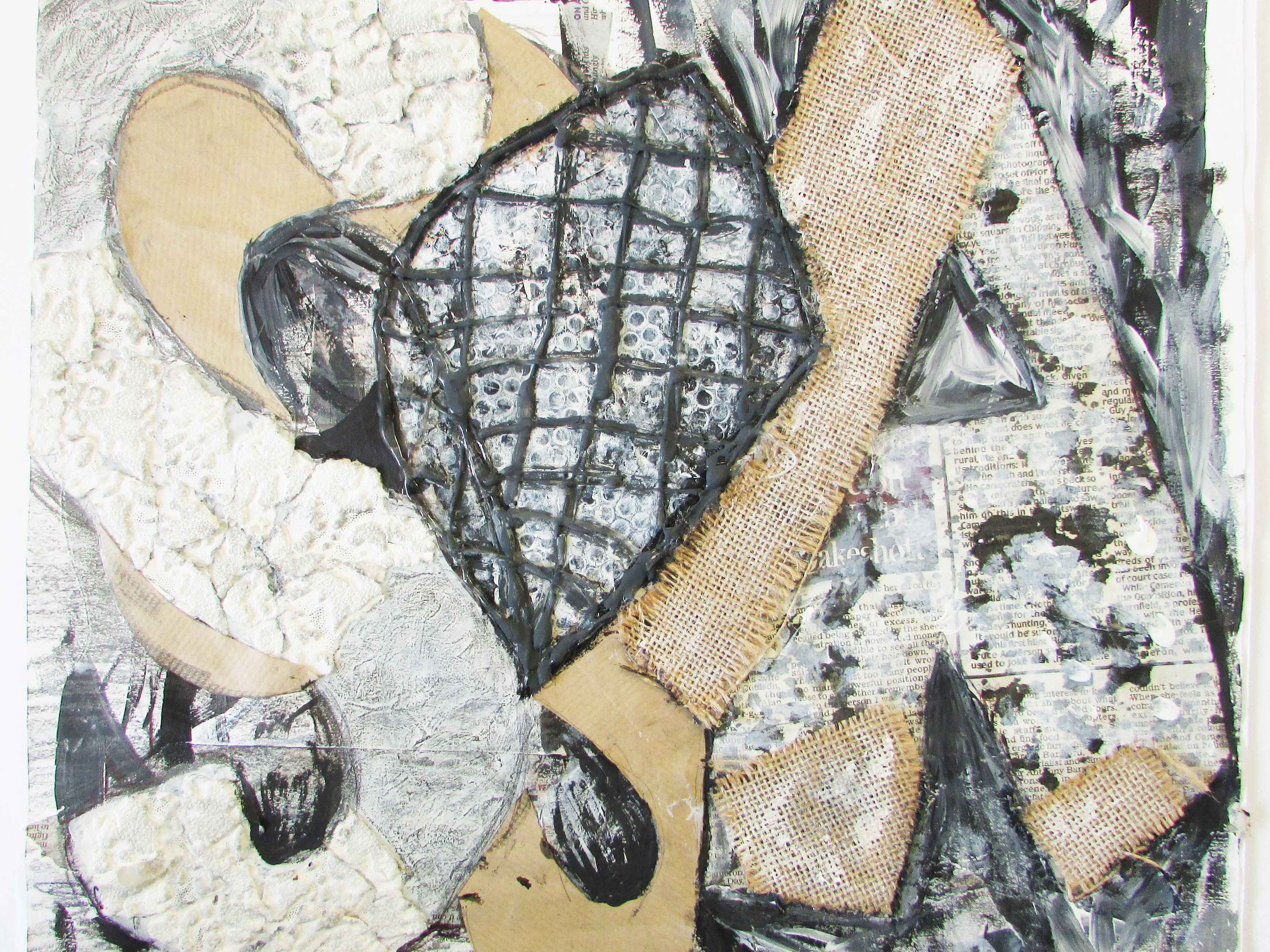
Below is my A2 Fine Art Sketchbook work for my Coursework on the word 'SPACIAL'. My Study sheets for this project are uploaded separately. On this Project Content, I mention my project brief on what I researched and experimented with. I have only included images above that I felt were my best to include in my digital portfolio as i will have my sketchbook will me to interviews etc.
In July 2015, I picked out the word 'SPACIAL'. Originally, I had no really idea on what to do for this outcome never mind what the word meant. Before I started my sketchbook, I created the word in a 3D form using scrap material and toke photos before creating drawings from (study sheets). To start with I looked into the word and gathered a information on areas to look into. I begin looking at sculptural work in wrap paper forms. This was basically creating sculptures using paper and drawing the negative space around them before progressing to taking photos of areas I considered to be classed as 'spacial' on my camera. This inspired me to research into the artists of Christo, Barbara Hepworth, Toba and David Hockney.
Hatton Gallery was a University Art Gallery I visited while in Newcastle during the Summer of 2015. In this gallery included many known artist work including Antony Gormley, Kurt Schwitters and John Roddam who's work all consisted of 'special elements'. Roddam's work of Rockpools took me on a journey to look into life below the waterline including primary images of a Sealife centre and other artists such as Claude Monet, Naomi Schlinke, and David Miller.
In this sketchbook I looked into other areas, regardless of being literal or lateral, of what could be classed as 'Spacial' after my mind map at the beginning to this project. This included: Confined Space (small areas), Weaving (The space/room between the weaving stripes and I looked at the artist Ellen Jackson), My visit to Botanical and Winter Gardens (plants that change their space - for example Venus Flower Trap), Personal Space (Comfort Zone Possible Outcome I looked into, creating a concept), Spider webs and Venus Flower Baskets (The holes in my opinion represented space), Slinky and Mobius strip (Reminded me back to the wrap forms from previous experimentation), Universe and Human Nerves (Comparing the space between both types of space), and finally star constellations (how a space changes as stars move creating constellations).
For My Main sketchbook in September 2015, I started to research in depth more and experiment more, looking into existing areas I researched and new. I started with word art and creating art using my word. This lead me to look into other words that mean spacial but also artists who use words to create art such as Jamie Poole, Jenny Holzer and David Buckland who all use words into different ways - physically and/or projecting words. Subsequently, I looked into Maps and Boarders, experimenting with different medium looking at how space is scaled down to show a bigger picture. This lead me into looking into small islands, particularly Tristan da Cunha. Furthermore, I experimented with the area of 'Spacial Sculptures' again moving into positive and negative space using the idea of the paper sculptures spelling the word maps out, to create my own sculptures which i created paintings from. This steered me towards objects hanging in space and researching artists: Henri Matisse (cutting out pieces- collage effect. Possibly can hang these pieces.), Juan Sanchez Cotan, Alex Calder and Cornelia Parker. I Hung the map sculptures I created before moving onto a new concept. These artists helped me develop my concept of Perspex Letters of the word 'SPACIAL' and other words relating to it. Obviously Perspex is translucent meaning the colours from the Perspex change the space when hanged or reflected. I experimented using this technique by laser cutting the word and not only painting and hanging them, but also using a light to reflect the Perspex onto the floor by creating mini sculptures and looking to colour, texture of the surface and scale/length to see how each type effects the surrounding space. This concept also was develop by my previous research into artists such as Jenny Holzer. Then I looked into little urban figures that demonstrate how scale is an important factor of space, before looking into large sculptures by Claes Oldenburg.
Going Public Exhibition- Dec to Feb 2015-16
While looking into different areas for the word spacial, I visited several galleries that took part in the Going Public Exhibition. This was a Key element of my coursework and the initial idea for my final outcome (In a different upload). Seiko Kinoshita's Fluorescent Protein Origami was the main influence of my Outcome looking like a DNA Strand, I made the connection of internal space vs external space, in this case maps. Road maps and Arteries/ Veins are very similar in terms of shape and pattern. This is where I expanded my use of medium by acetate sheets of either a road map or human maps (The systems) over the opposite map underneath. I continued using this by drawing over maps, creating lino cut and dry point prints of maps (external and internal) before researching into human facts to bring another layer of research relating to the work of Jamie Poole. I also researched into the scale of the universe, planet and star signs (external and internal stars), and humans facts in relation to the length on a map. for example, blonde hair grows 13 miles roughly a year if you leave it to grow, that's approximating the distance of Rotherham to Sheffield.
From all of this I changed my thought process by starting to develop my existing idea by layering acetate on prints, cutting prints up to create a collage- Henri Matisse inspired, by cutting both acetate and print work, painted Perspex letters into collage, including facts using Jamie Poole as inspiration, overprinting prints with different maps, planet and star signs painted onto acetate, drawing maps on the collage to create new maps. This helped me create several mock ups before deciding on the size of the outcome.
Details of the outcome, its evaluation and alternations made during the building process will be explained in my separate upload following this one and on my blog artwithatwisthlm.
One of two photos which I took of my 3D Spacial form made form wire, holographic hole wrap, textured card and cardboard. From this I created a mixed media piece that was submitted to Sheffield Young Artists Exhibition.
One of two photos which I took of my 3D Spacial form made form wire, holographic hole wrap, textured card and cardboard. From this I created a mixed media piece that was submitted to Sheffield Young Artists Exhibition.
This is a painting of the 3D Spacial form using modelling paste and acrylic paints.
Spacial Mind Map of possible areas I could have looked at to create a starting point for me back in July 2015.
This page basically is a definition of the word 'Spacial' and quick doodles of what I initial thought of to do with spacial including wrap paper forms, crackle paste and rubix cubes.
Here is the wrap paper form sculptures I created using card and created by sticking corners In places and using scissors to create the shapes.
Here is a few images that were taken around the building of where I study that I envisioned to be classed as spacial. Some of these images have arrows or/and biro lines drawn on them. These images I developed by zooming into these areas and enlarging them to experiment with them.
This image is of my rockpool/ sea life pages into the space under the sea. I used oil Paints to create my own drawings (not shown) and experiments.
Here is my weaving pages on how to weave. I used leaves from a palm tree as well as ribbon and paper. The reason behind that was to relate it and create a good transition from the Winter and Botanical Gardens pages.
This is one of my pages of the images I took and drawings I did while I visited the Winter Gardens for inspiration to do with the word Spacial - eg Venus Flower trap.
Here is a acrylic paint sketch I did using a palette knife to apply and a biro to add detail. This was a drawing from an observation drawing I did while I visited the Botanical gardens.
This is my quick development of the comfort zone/ personal space concept I development in my summer sketchbook (explained below on the blog).
Stress = red out of the zone
Calm= blue in the zone
This is from when I started to look into External Space and compare galaxies and milky ways to the nerves in the human brain and cells and how things are similar in different scales.
My perspective of Jamie Poole's technique using one of my primary images from around the school to create using just words and paint.
These two pages are when I started to explore Maps and boarders and created studies from altering the space around them.
Here is my development into wrap paper form sculptures where I used emulsion paint, yarn, card, masking tape, charcoal, newspaper and graphite to create drawings of other wrap paper forms.
This is my positive and negative space aspect where I have use my maps concept, cutting out the word before creating paper sculptures and using them to create paintings from.
This is my quick page on Henri Matisse where I use different maps and created collages before adding the word spacial across both panels. He becomes an important piece to my coursework outcome.
This page is from my Hanging Object area where I hung my maps letters and created a watercolour and brusho mixed media study from.
Here is a few images of my Perspex letters that I created sculptures from and added light to create shadows to work with and create paintings from.
This is a page about the Little Urban Figures. I researched this to link with my section on Scale and how space from on perspective can look completely different in another.
Here is my beginning page of the Going Public Exhibition I visited - Graves Park, Sia Gallery, Site Gallery, millennium Gallery, and Sheffield Cathedral. This is where my Initial idea came from and helped me achieve the grade I did.
This is the work of Seiko Kinoshita- Fluorescent Protein Origami, which helped me form the idea of comparing internal and external space. This is a protein strand that reminded me of a DNA strand before I read the information with the sculpture.
This is my first acetate print of a internal map over a external map to see how layering maps would look like and compare them against scale of each one.
This is a drawing of a human nerve cell on a external map. The purpose of this was to experiment with mark making and a different way to layer maps over each other.
This is two prints - one small, two stage lino cut and a larger stage one lino cut. This was created in my print making lessons and became a huge structure to my final outcome.
Here is the start of my compositions for my outcome. I development many different compositions from hanging pieces and using projection so you have to stand in a certain place for the piece to make sense and the space changes as you move around it. A hanging piece for each planet in relation to a human fact. This eventually progressed to one map collage
This page was a experiment to see how a human fact is in relation to a scaled map. These were more internal space facts opposed to external facts on humans such as hair length.
This page was a development of acetate on top of prints layering different textures together. This is one of the mediums I used in my final outcome.
This experiment was a quick one experimenting with prints, maps and acetate to create a collage and to see whether this would work for my final piece.
This is a collage of a dry point print and a lino cut print. These were small sections which I placed together on my page as my final piece was 80cm x 80 cm. This was an important experiment in my research to see whether this would work and how it would work.
This piece is my painting experiment of the reflected Perspex sculptures to add to my final piece. This was a practice to see how I would blend all the colours. I did this by diluting the acrylic paint and adding layers of colour on top.
This was an experiment to see visually how using facts would fit on road maps. and which size and font works the best.
This is a triple overprint of my dry point of a road map of the midlands in the UK. I used three different colours in this print as an experiment. I included this print into my final outcome so I scanned this into the computer to print so that I could use the original in my outcome.
This is a quick collage of a lino cut print section, a map which i replaced the middle with the print of and biro to fill in the roads. I attempted to line everything up and make the roads continue.
Here is a quick mock up of one of several, to see which style I like. This is the one I decided on as the mock up with Perspex was too heavy in my opinion to add on.
This Page is where I started to work out the size of my prints I had, the amount of acetate prints I had, and how many road maps I needed to cover the 80cm x 80cm map of Sheffield had. Also I had to work out the amount of facts I had (22) and how to cut the MDF Board to fit the map on. This resulted in my cutting and super gluing the MDF to create a square as a standard piece of MDF is too narrow for it.
This is a page in my sketchbook explaining the alterations I made from making my final outcome. This is explained further in my A2 final outcome project post. These alterations included sewing on tracing paper, Pins to mark facts and a boarder around the final piece.


